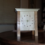
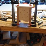
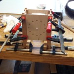
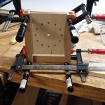
 The clock was an experiment for me. Some of my earliest projects, I never used any sort of plans, except for maybe a quick drawing on paper. The projects were either extremely simple…..or just didn’t end as well as I expected. What really helped me increase the quality of my projects is drawing them up before hand with sketchup, and every major project I have done for the past 3 years I have made a drawing for. During this time, I like to think I have become a better woodworker by pushing my limits when I can. This project, I pushed my limits by using no design whatsoever, not even a napkin drawing. I did take inspiration from photos, and some help from my wife.
 Part of the design challenge was also having elements in it that allowed me to use new techniques that I have not tried before. This turned out to be resawing on the band saw to make the 1/4″ thick panels.
As for the design itself, after I laid out and drilled the holes for the face, I was concerned I made the face too big for the clock. Looking at the finished product now, especially since I simplified the top, I am happy with the size.  The one thing I would change on the design is the columns. I think I would have liked slightly thicker columns so that I could have made the tapers more pronounced. Even an 1/8″ thicker I think would have made a big difference. The top was a tough one. My vision was originally to make it much more ornate. However, once I got the first layer on the clock, I really liked the cleaner look of the flat top, so I stayed with it. The only other thing I would have changed, is the back. My scroll sawing experience is still very small, and I wish I could have made the cuts a bit more straight.
 Overall, I feel this experiment was successful. I like how it looks sitting on our mantel, and the feedback I have gotten has been very positive. Also I did enter it into my local Woodcraft’s gallery, in the small projects division. I am happy to report, that the clock took third place in that division! Will see what I come up with for next year’s gallery! 🙂
